Hello there internet friends! Yes, let’s acknowledge the obvious – this is another post about blogging photography tips. I’m always in two minds about writing posts like this; blogging about blogging is all a bit too meta for my liking, I think. However, I was recently looking back at some old posts (I have a lot of time on my hands, okay) and was actually flabbergasted at the state of the photos I used to put up on here. It was literally as if I had never held a camera before. I’ve been putting a lot of effort into improving my blog photos lately, and posts such as this have really helped me along. So, although I know that my images are still nowhere near as good as I would like them to be, I thought I would share some of the best blogging photography tips that I’ve learned along the way in case any of you are struggling too. For most people, this will probably all be super basic stuff, but if it helps anyone else stop taking photos like that one above, then I will have succeeded at something in life.
Play With the Composition
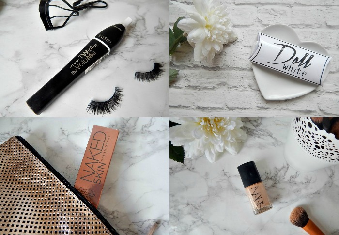
How your items are positioned in a photo can have a big effect on the overall image quality. These days, when it comes to product shots, like a lot of bloggers I prefer a ‘flat lay’ style. This is when you shoot from above, with the products laid out flat. This allows the products to really pop out of the image more as they’re not hidden behind other things.
Something I only learned recently, which is a tad embarrassing as it’s probably in some ‘photography for dummies’ book, is the rule of thirds. This is where you imagine your image divided into thirds, both horizontally and vertically. The rule is that the subject or most interesting things in the shot should be placed where the lines intersect. A lot of cameras will have this grid setting as an option when you’re shooting, so it can help you when arranging your products. You can learn more about the rule of thirds here.
Get Creative With Your Background and Props
For so long I would just photograph products on whatever surface was around. Wood table, purple carpet, turquoise bed sheet – they all got a look in, I did not discriminate at all. Eventually I realised these weren’t creating the best look, and so tried to take all photos on my white desk to give a clear, crisp background. This worked a lot better, and I still use this simple background when I feel that the products are a bit busy. However, I also invested in a couple of different backgrounds to add some interest to the photos, such as my marble background, which is some sticky-back plastic mounted on a piece of cardboard (you can buy similar from Amazon), and my most recent brick-effect wallpaper sample (which I got from eBay). I say invested – these literally cost a couple of quid each, and so they’re well worth picking up.
Props are another thing that I also only recently brought into my blog photos. Flowers, trays, magazines, makeup bags and brushes are all popular options and are all usually things you have around the house.
Find Your Editing Style
The chances are that however great your layout and props are, your image probably still isn’t going to look perfect in its raw format. I think most bloggers edit their pictures at least a little, and finding a programme you’re comfortable using and a consistent style you’re happy with can really help. I personally use Pic Monkey, which is just an online editing tool. As a standard I will also re-size my image, increase the brightness and increase the clarity. Sometimes I may also play with the contrast, shadows or sharpness if I think it needs it, and I also might crop if my composition didn’t look quite right. When it comes to filming, I think you can really tell the difference between a good camera and a not-so-good camera (and FYI whenever I get into Youtubing, I will have my eye on one of the Panasonic 4K cameras); but for photos, editing can really bring lower quality images to life and make them look far better than they are.
Having a consistent look to your photos will not only make each individual post better, but it also makes your entire blog look more cohesive and ‘on brand’ if you like. It also helps your Instagram account look much better if you share blog photos on there (but that could be a post for another day)(or not, who the hell knows).
Those are my main blogging photography tips, but I would love to know more! Add yours in the comments below.




This is honestly helpful and I will take it on board as my photos need improving! When I look back to old posts they are catastrophic though so embarassing haha xxxx
Glad I’m not alone! I love your photos now though, so I can’t imagine you needing any help 🙂 xx
Good tips! One I have never ever seen before is the buying backgrounds, I would never have believed that you didn’t have an ultra-cool marble/white brick interior design goin’ on!
Definitely going to look into that 🙂
Jesska – Opal Soul
Haha I was amazed when I heard this tip from another blogger too! I thought everyone just had amazing tables haha xx
I absolutely love these tips, you are definitely right! Thanks for sharing! 🙂
Sarah / Sarah Smiles
Thank you, glad you liked it! xx
Great tips – I suck at photography, it’s one area of my blog I am really trying to improve!
It’s hard but so worth it when you start to see improvements I think 🙂 xx
Very helpful thank you!!! Love the backgrounds X
Becky Shannon xx – Life-by-Becky
So glad you liked it Becky 😀 xx
I feel you, my photos are still nowhere near as good as I’d like them to be but when I look back at my earliest posts, I can see I’ve come a long way. I guess it’s a learning curve but it can be a frustrating one!
The Beauty Locker
SO true, I suppose it’s important to appreciate how much progress we’ve made 🙂 xx
these are great tips 😀
Pam xo/ Pam Scalfi♥
Thanks Pam! Glad you like them xx
I find my photos turn out so much better when I leave myself a little more time to play around with composition – you’re right, it’s really important! xx
Jasmine Talks Beauty | High-End Palette Giveaway
Definitely, often my composition will change completely from what I started with – worth giving yourself the extra trial-and-error time xx
I love photography tips, thanks for sharing! I love getting creative with different props and backgrounds, it’s so much fun and it’s such a fab feeling when you are proud of your photos 🙂
alice x // beautybyalicee
Yesss it’s the nicest thing isn’t it! xx
Thanks for the tips!
You’re welcome, I hope you found something useful 🙂 xx
Lol I can relate, I used to stake outfit photos in the mirror on my iPhone!
Lauren
livinginaboxx | bloglovin
Haha those were the days! xx
I always think I love the marble look that people have with their photos and I have never even thought to buy marble wall paper! Such a great post this has helped me a lot! x
Liz | LotsofLoveLiz ♥
I was the same until recently, thought people just had really fancy tables haha! xx
some really good points here! I love the title too made me LOL x
Haha glad you enjoyed 🙂 xx
Oh I might have to have a little look on Ebay for some blog backgrounds – genius! I love the white brick one, it looks great.
Photo-Jenn-ic
Yes, definitely check it out! I’m on the lookout for a white wood effect one next 🙂 xx
The struggle of blog/ Instagram/ blog photography is so real. I recently invested in a fantastic white desk from Ikea after months of fiddling around with A4 pages.
I definitely edit almost everything, purely as I’m limited to sunlight and awful, 40watt artificial yellow lighting, so the brightness & exposure always get twiddled a bit!
Ahhh my white Ikea desk was also so worth the money! 🙂 xx